QEHB Charity

DISCIPLINES
Branding
POS and merchandising

Brochure design
Exhibition graphics

CLIENT
 QEHB Charity

Image of the wire-bound QEHB Charity Brand Guidelines edition 1. The cover shows a comical image of a tandem skydive with the participants smiling and pulling funny faces

BACKGROUND

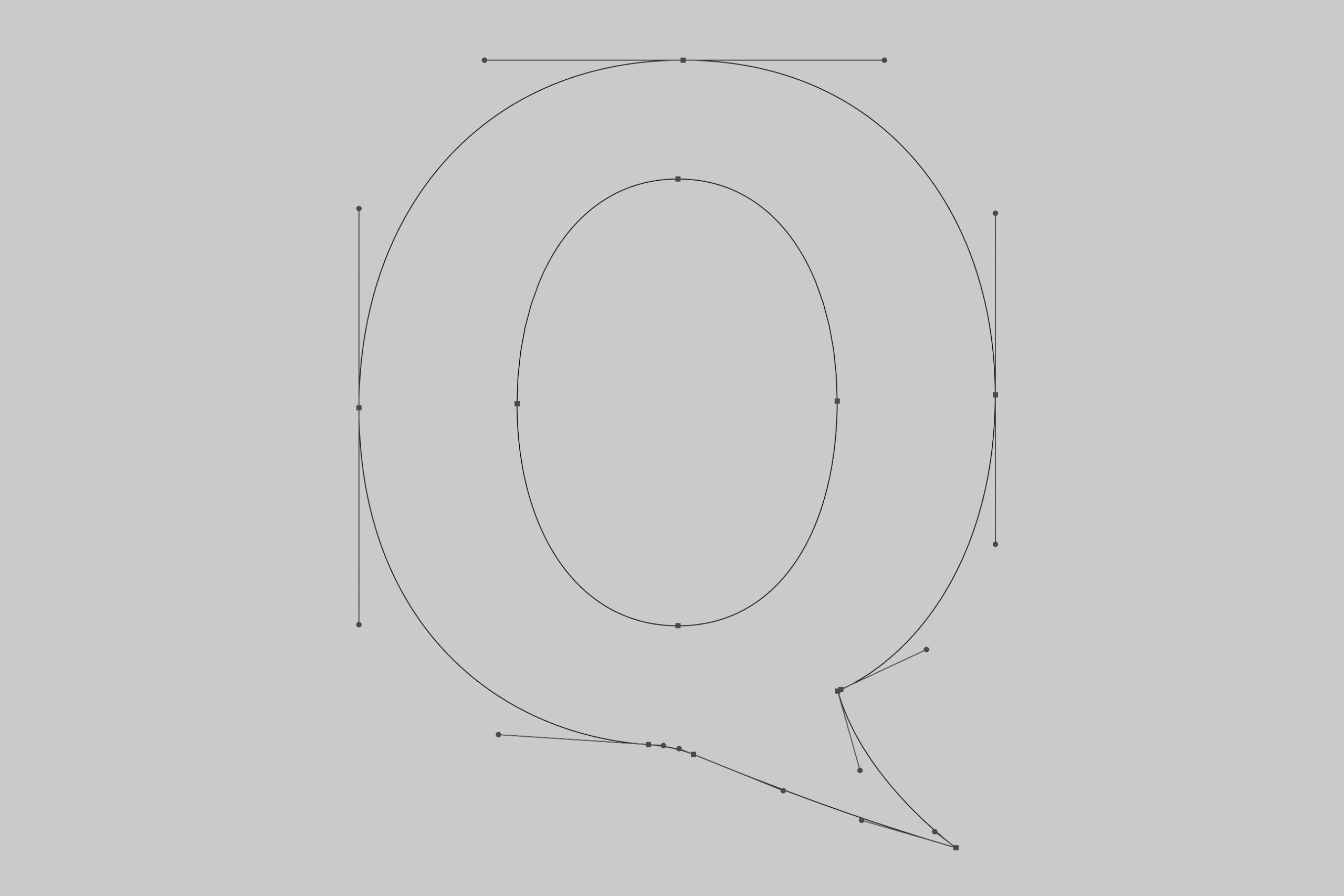
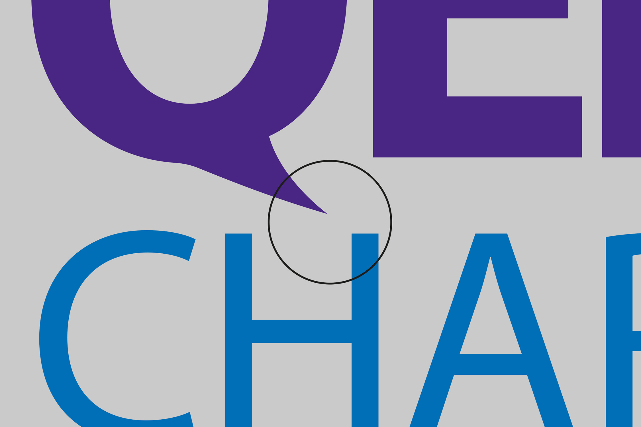
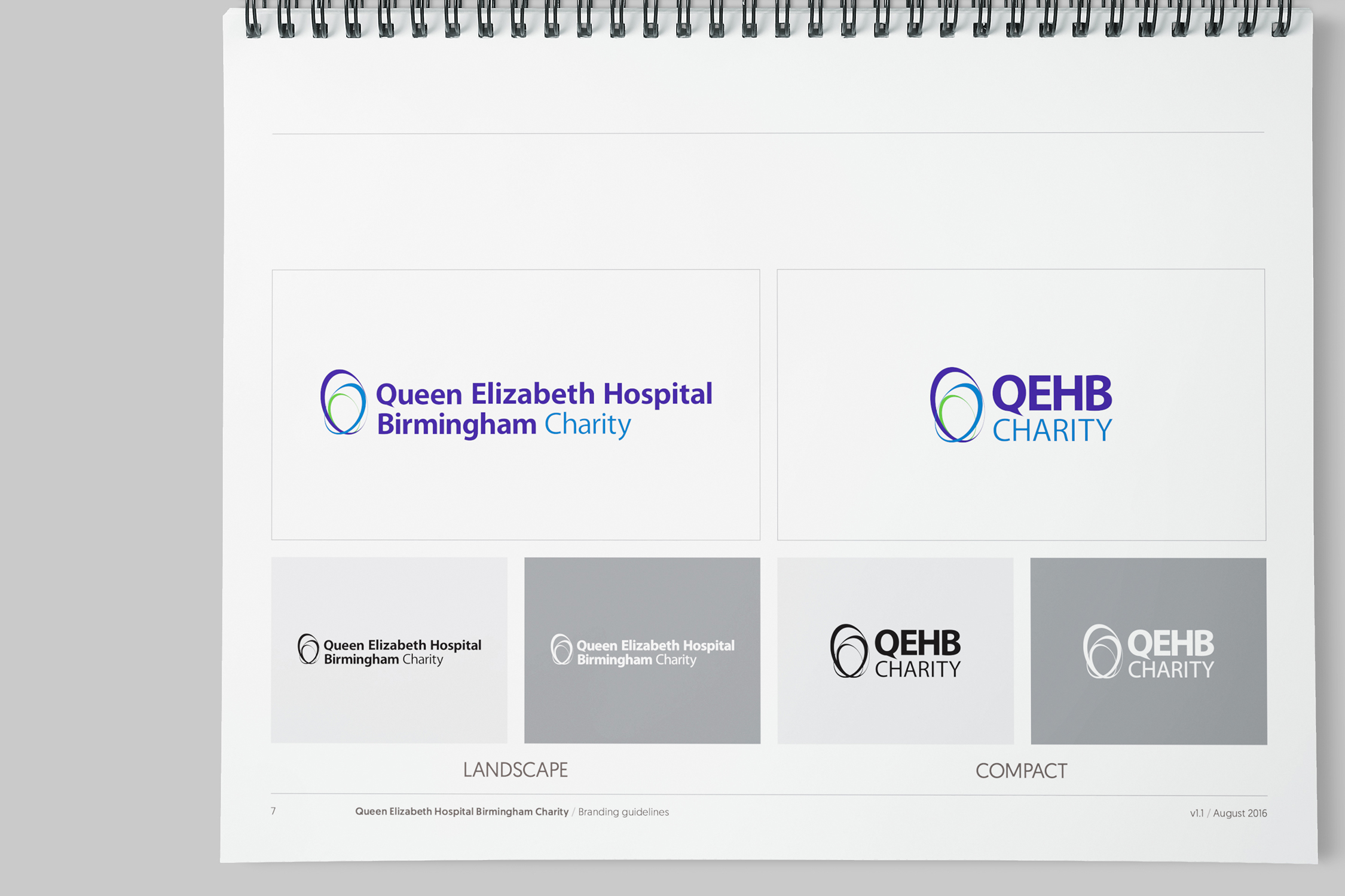
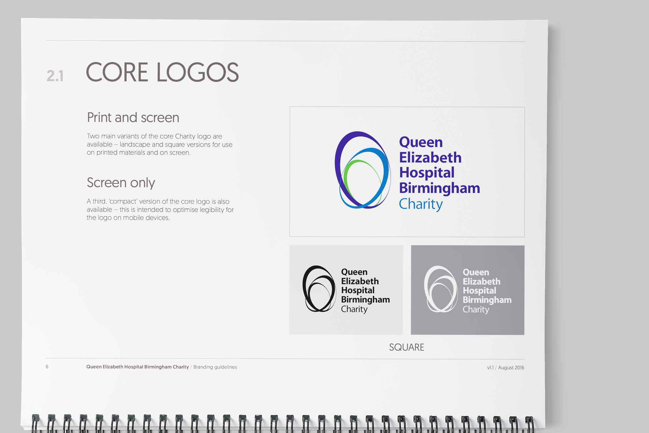
I was working as Graphics Lead for the in-house design team at UHB NHS Foundation Trust when we were invited to bid for the work of rebranding the affiliated hospital charity. With a tight deadline looming, the team collaborated closely to discuss and agree initial approaches. Our key focus was on rationalising the uneven approach to the charity's existing brand, building in future flexibility and ensuring a cost-effective and smooth transition to the updated brand by reworking the charity's existing logos (which in turn were based on the trust's brand). The team took a truly collaborative approach, with concepts contributed, developed and owned by designers at all levels. Optimising the new brand for digital was also a core concern, and entailed the development of a 'Compact' logo with custom letterforms to condense the long charity name to a more 'manageable' size for smaller viewports. 

The eventual bid was a successful one, with the graphics team going on to provide a dedicated account manager, along with print buying and design services for the charity.

Image of the QEHB Charity retail kiosk in the foyer the Queen Elizabeth Hospital Birmingham. Inside the glass-walled shop are shelves containing QEHB branded clothing, stationery and accessories.

BRIEF

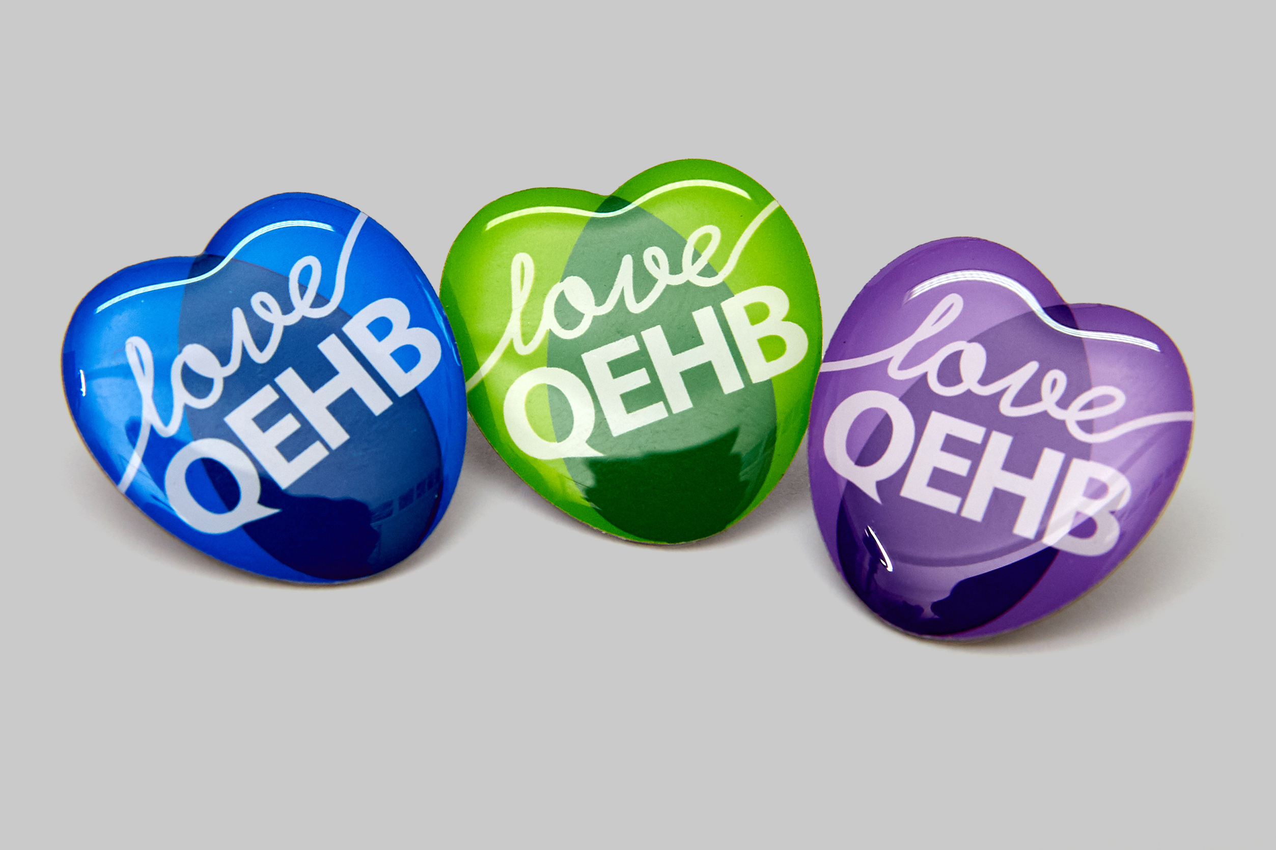
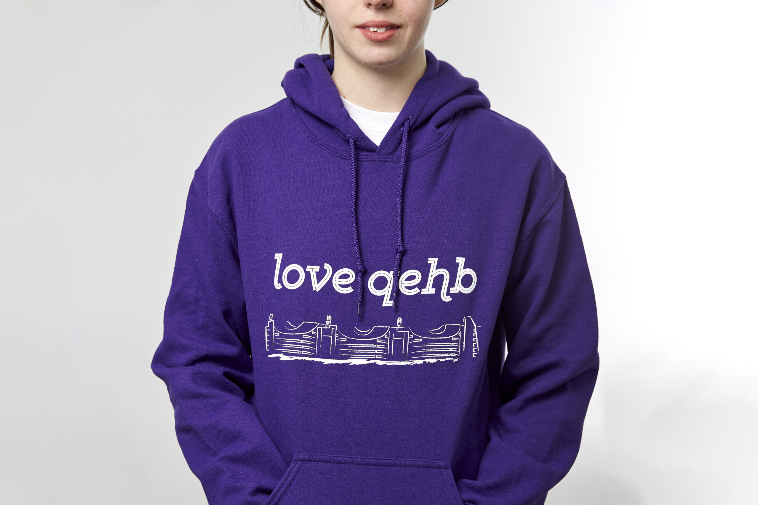
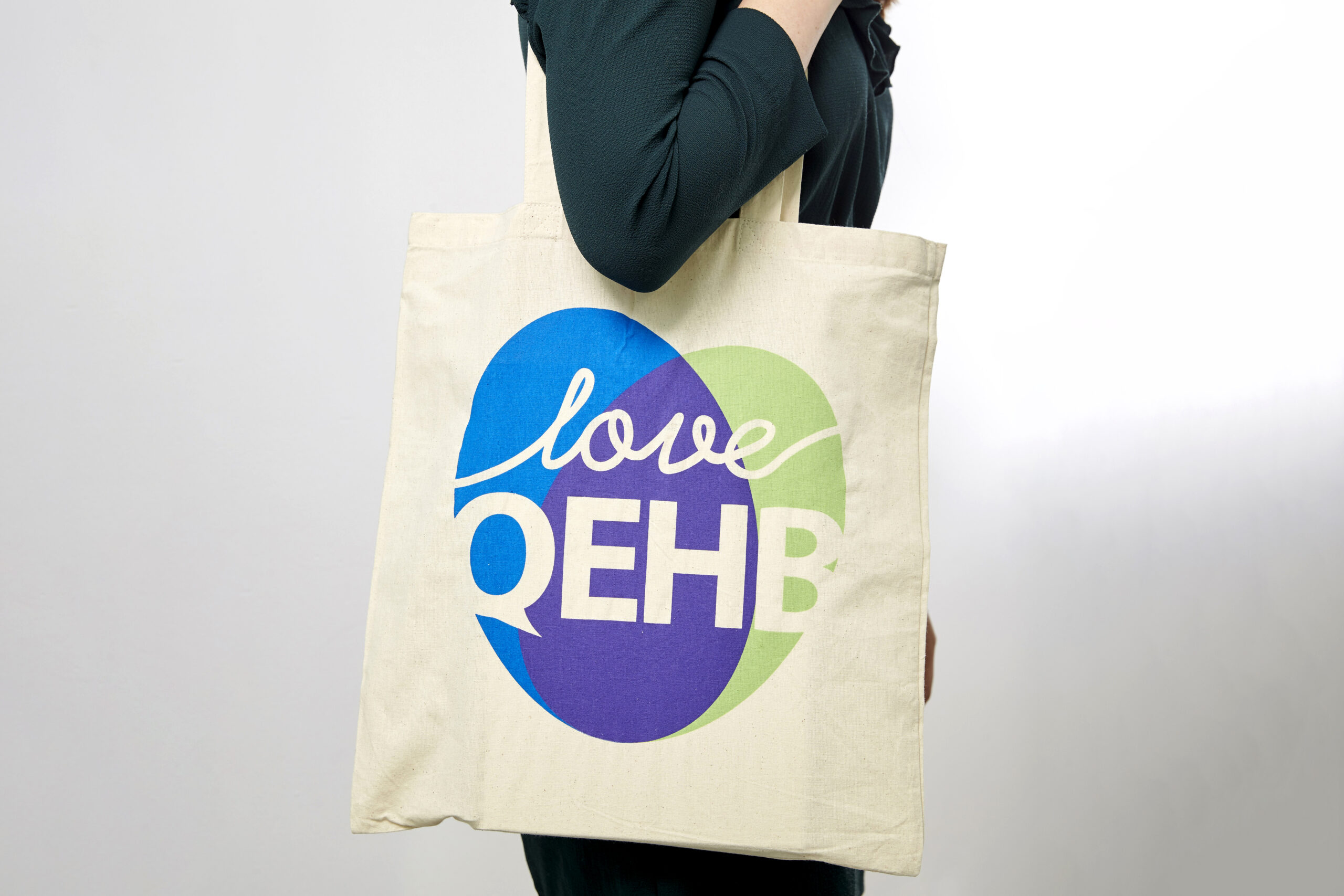
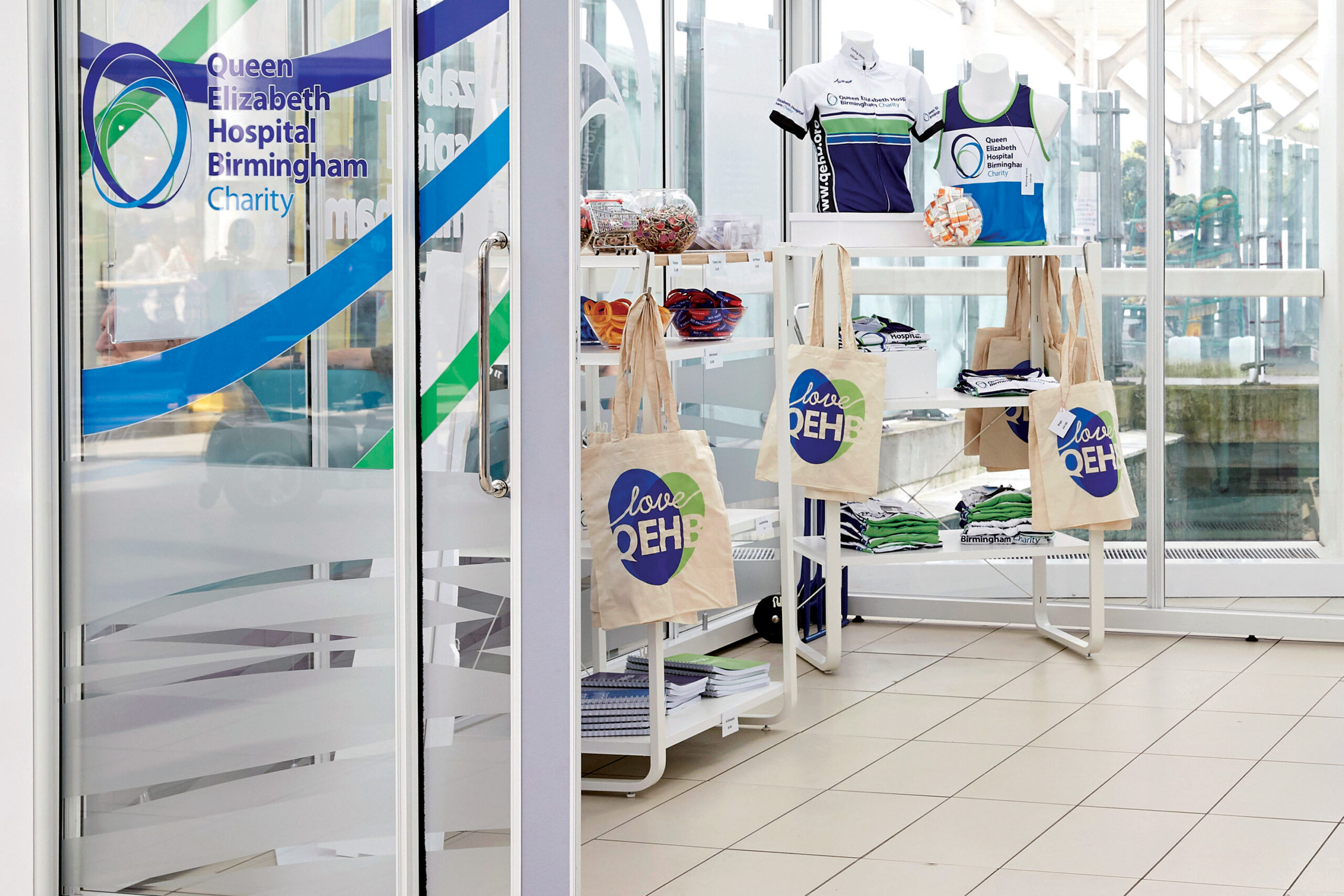
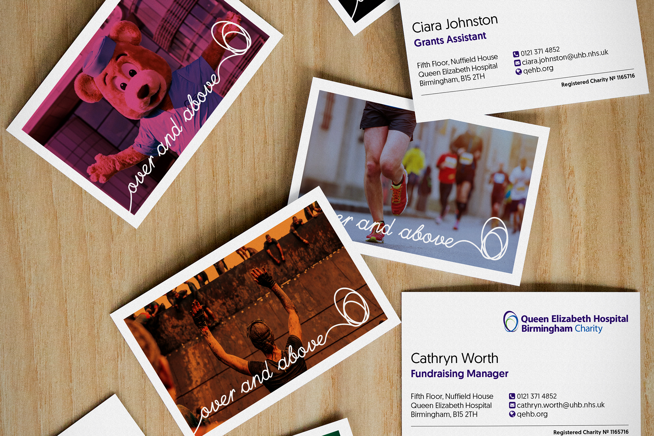
The QEHB Charity had experienced an period of accelerated growth and expansion in both donations and the number of funds it managed. The charity's campaigns and various funding streams had expanded to match, but with no internal design resource, the brand had developed with no clear strategy or consistency. The re-brand project was an opportunity to revisit and rationalise the existing brand resources, and also develop a more strategic approach to easily accommodate future developments. The charity was also keen to expand its range of fundraising merchandise, with a view to opening a retail concession within the hospital itself, so this also formed a key requirement for the brief. Finally, the charity team was keen to develop flexibility and a less 'corporate' look and feel for key public-facing campaigns.

The redeveloped brand was rolled out in 2017, with the strategic element quickly tested when the charity expanded again to incorporate the charities from other large Birmingham hospital trusts. The new brand was further developed to successfuly incorporate the additional trusts and campaigns.

Core brand elements

A wireframe image of the customised 'Q' letterform developed for the new brand. The tail of the upper-case 'Q' has been redrawn to form a hook-shape, reminiscent of a cartoon speech bubble.
A close-up image showing the customised 'Q' character in place on the 'Compact' logo variant. A thin circle indicates the redrawn letter shape and how it interacts with the rest of the logo.
Spread from the 'Core Logos' section of the charity's new brand guidelines, showing the 'Landscape' and 'Compact' variants
Spread from the 'Core Logos' section of the charity's new brand guidelines, showing the 'Square' variant

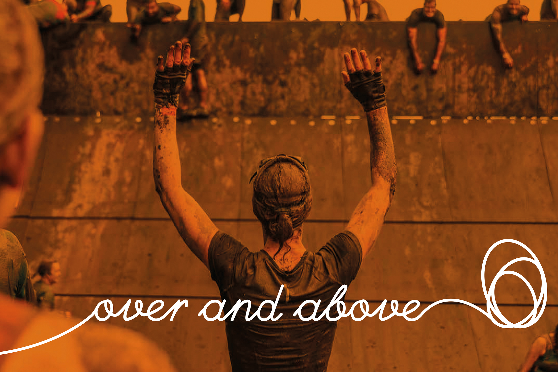
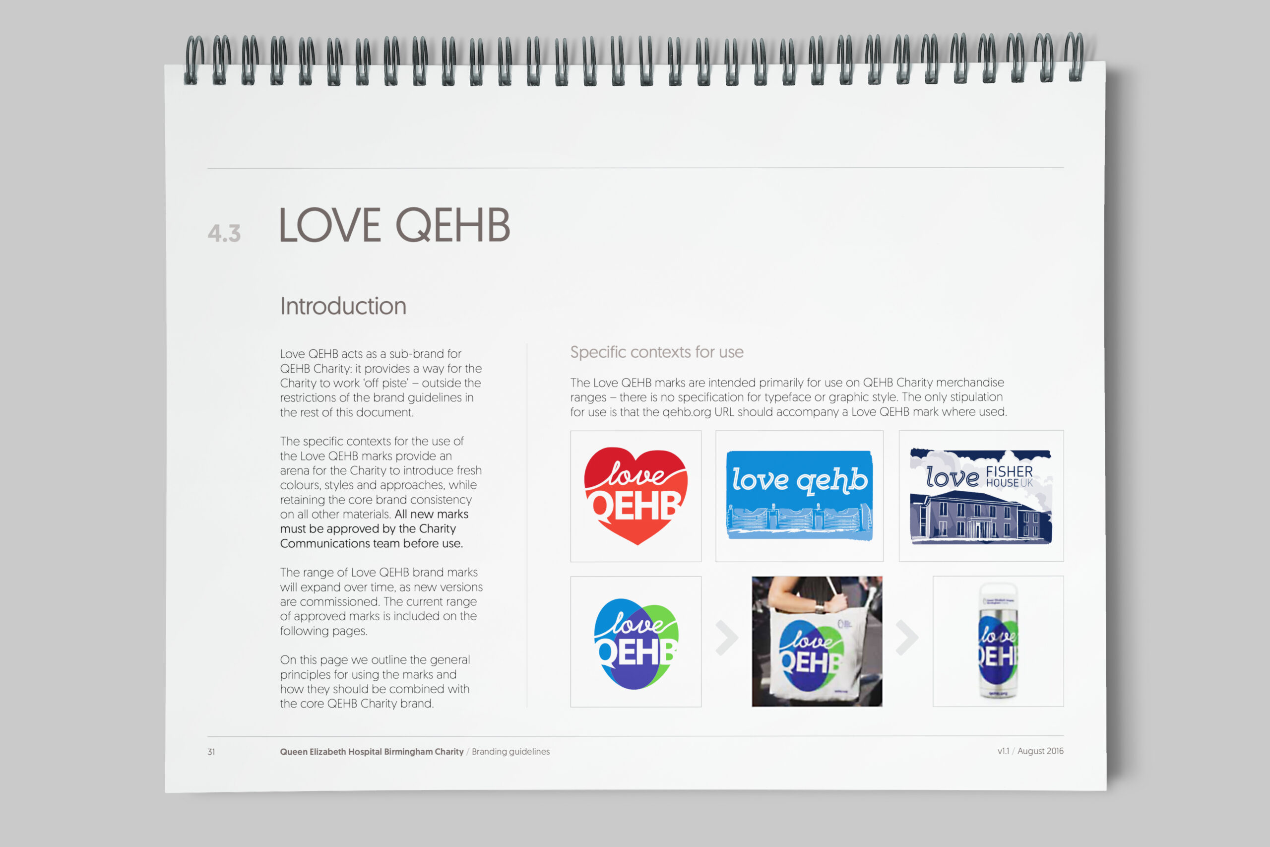
Strapline and sub-brands

Business cards with a colourful variety of images are scattered on a wooden desktop. Each card incorporates a different image overlaid with a colour wash and the 'Over and above' charity strapline.
The
The 'QEHB Heart' sub-brand, consisting of green and blue overlapping ovals forming a heart shape. Overlaid on the heart are the words 'Love QEHB'
Spread from the 'Love QEHB' sub-brand section of the brand guidelines, showing the variety of marks developed for use on fundraising merchandise

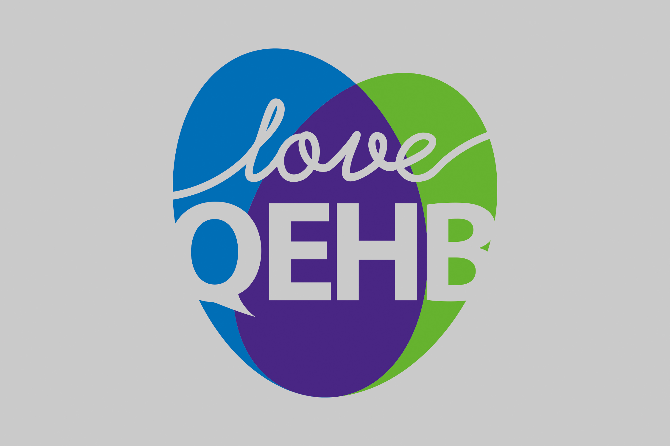
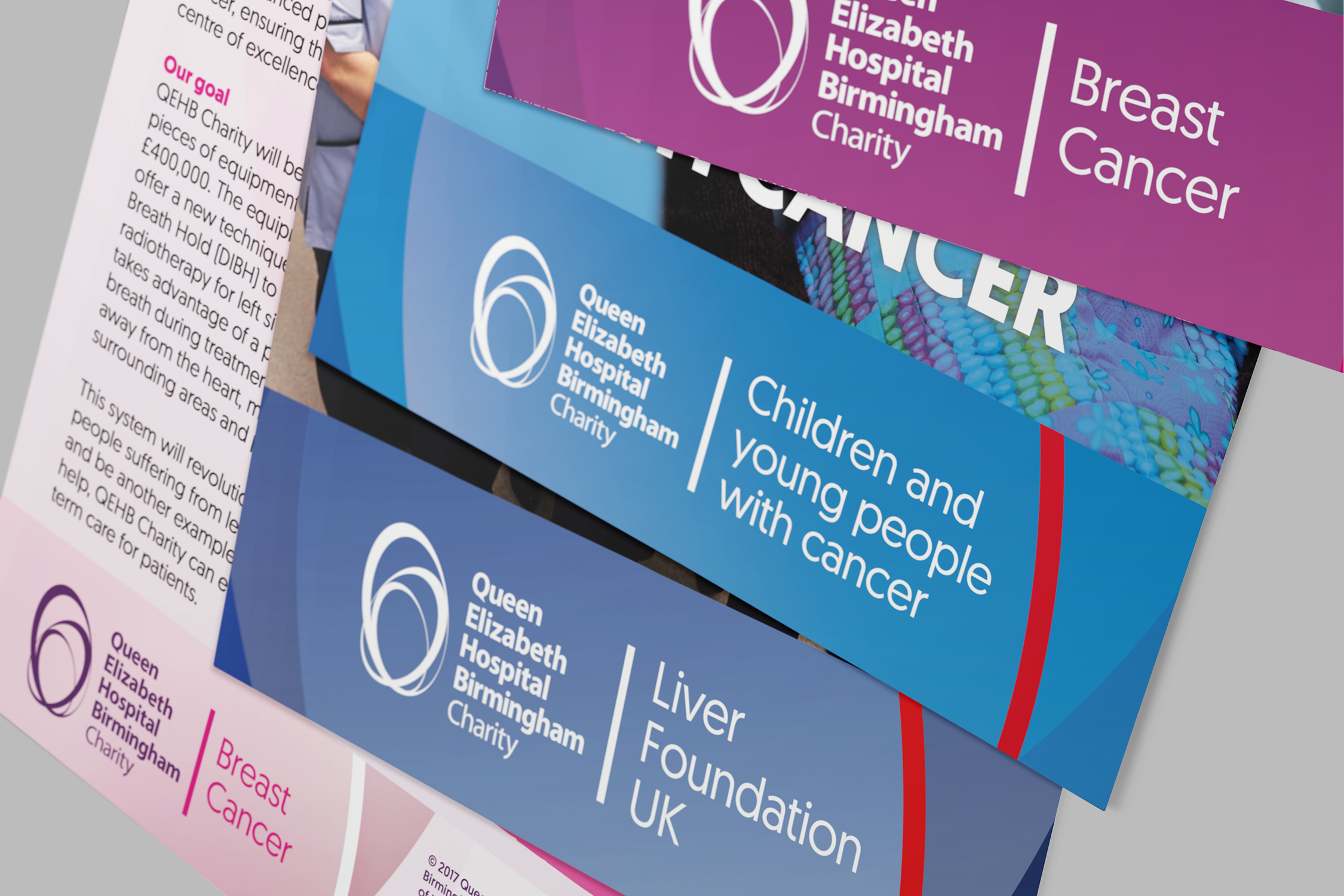
Charity fund branding

Sample page from the 'Internal funds' section of the QEHB Charity brand guidelines showing brand palettes for two funds. The initial rollout of the new brand incorporated redeveloped logos for 10 different funds.
A variety of colourful leaflets are scattered on a desktop. Each leaflet incorporates a different QEHB Charity fund logo.
An A1 poster is clipped to a neutral grey wall. The poster shows a red apple hanging from a tree, with one of the Queen Elizabeth Hospital Birmingham's towers blurred in the background. Under the image the words 'Sponsor the trees at QEHB' are displayed in a playful handwritten font intermixed with images of flowers and fruit.

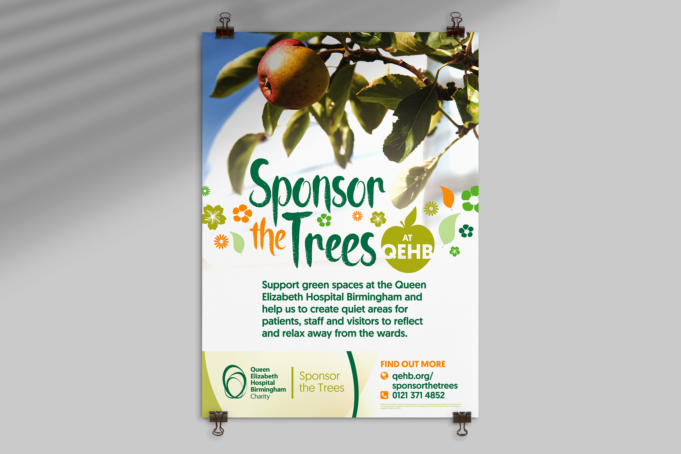
Fundraising merchandise

Three heart-shaped pin badges are arranged on a neutral grey background. The words 'Love QEHB' are overlaid in white on the blue-, purple- and green-coloured badges.
A smiling model wears a purple hoodie incorporating a hand-drawn image of the Queen Elizabeth Hospital Birmingham. Above the drawing are the words 'Love QEHB'
A model wears a QEHB Charity branded jute bag on her shoulder. The bag is printed with a green and blue overlapping ovals, forming a heart shape. Overlaid on the heart are the words 'Love QEHB'

   LinkedIn
   Pinterest
   Behance

© 2024 Justin Still