ClearCourse rebrand
DISCIPLINES
Branding
Publication design
Web design
Event graphics
CLIENT
ClearCourse

BACKGROUND
In early 2025, ClearCourse began the move from a ‘branded house’ to a ‘house of brands’ model – a decision made based on evidence that the group’s fragmented sub-brands were causing confusion both internally and externally. The ClearCourse team wanted a distinct brand communicating the unique position of ClearCourse tech as a business engine, not for large scale companies, but for real SMEs in the UK. The new brand needed to stand as a trusted group identity while allowing the group’s product brands to keep the spotlight, and appeal to founders considering selling their business.
The project had a six-month turnaround, from initial concepting to final delivery of a refreshed website, core collateral and a planned rebrand showcase at a high-profile M&A event.

BRIEF
I took the lead on this project, from initial concepting to guiding final delivery with the whole internal design team. The core brief was to position ClearCourse externally as an attractive home for tech and software founders looking to sell, with the internal priority being to consolidate the fragmented sub-brands into a single cohesive ClearCourse entity, boosting internal engagement and breaking down silos between teams. The crux of the design approach was to develop a single new treatment for the existing group brand, while allowing for variation within the system to denote different verticals and functions within the business.
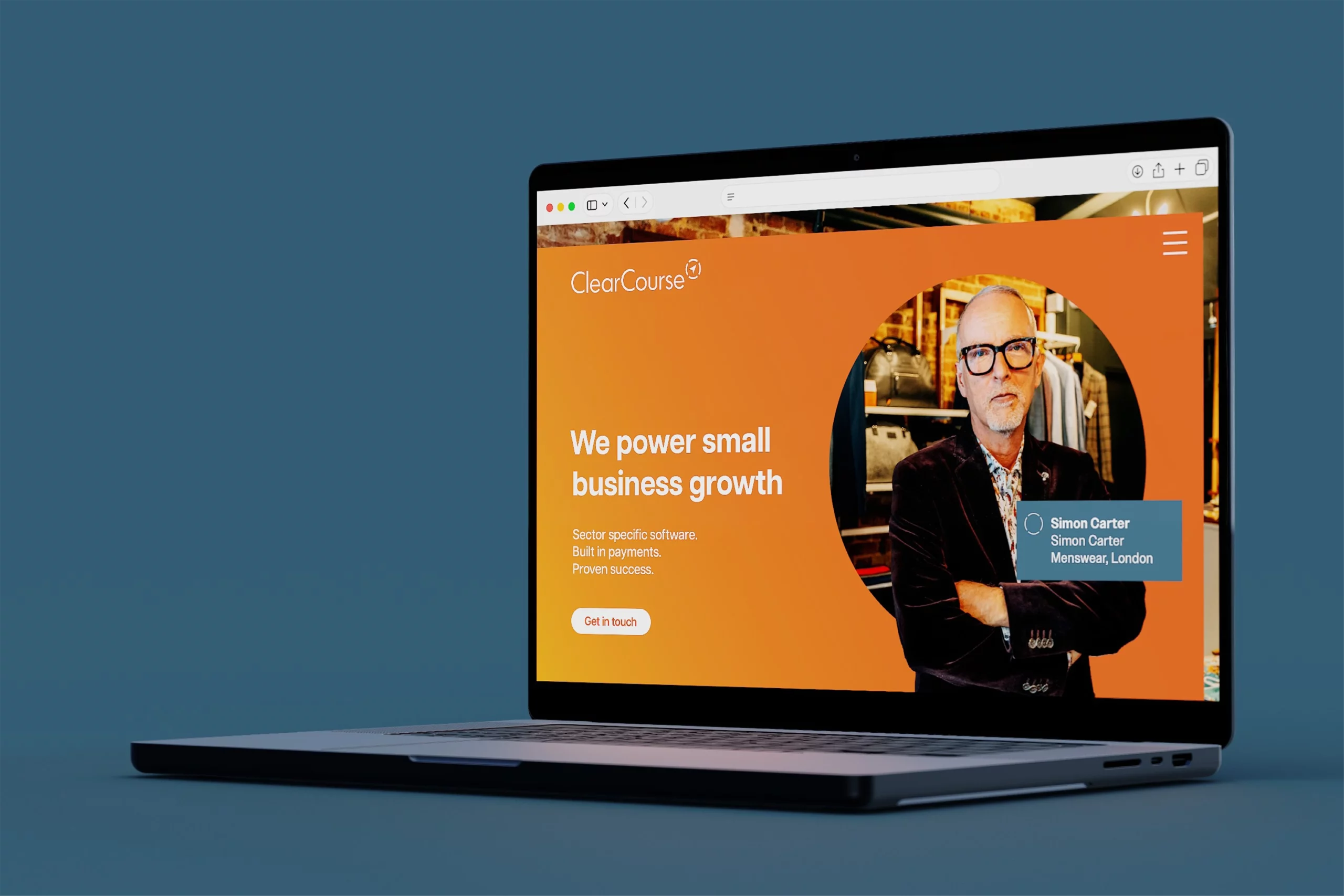
A central visual approach was established, using a common language of intersecting geometric shapes and layered imagery. This was retained for core group-related use, with a system of icons used where required to denote key verticals and business areas.
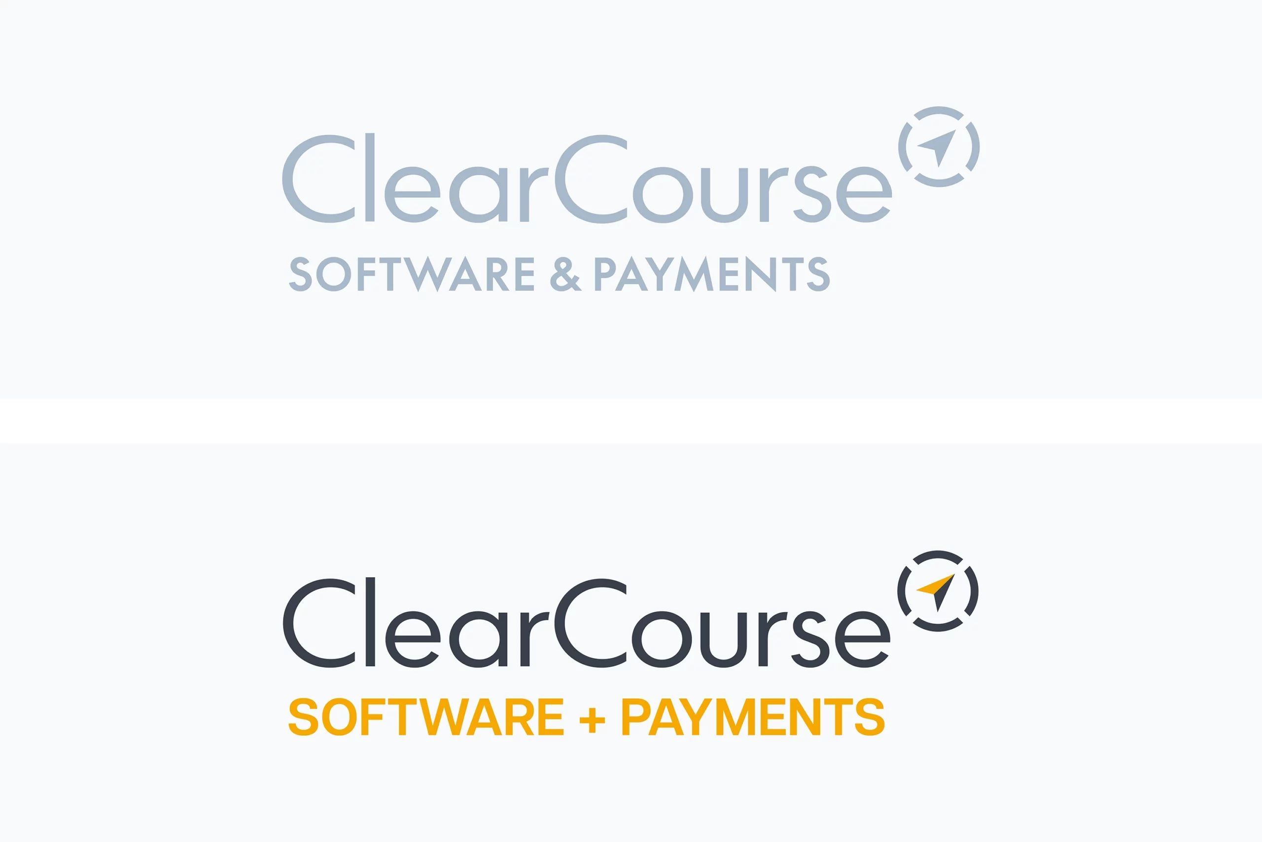

The existing ClearCourse logo, in use from 2023, was retained but redrafted to improve proportions and legibility. Existing sub-brands such as ClearCourse Health and ClearCourse Sports were discontinued in favour of an iconography system (based on the geometry of the ‘compass’ icon) to represent each vertical without fragmenting the core brand.
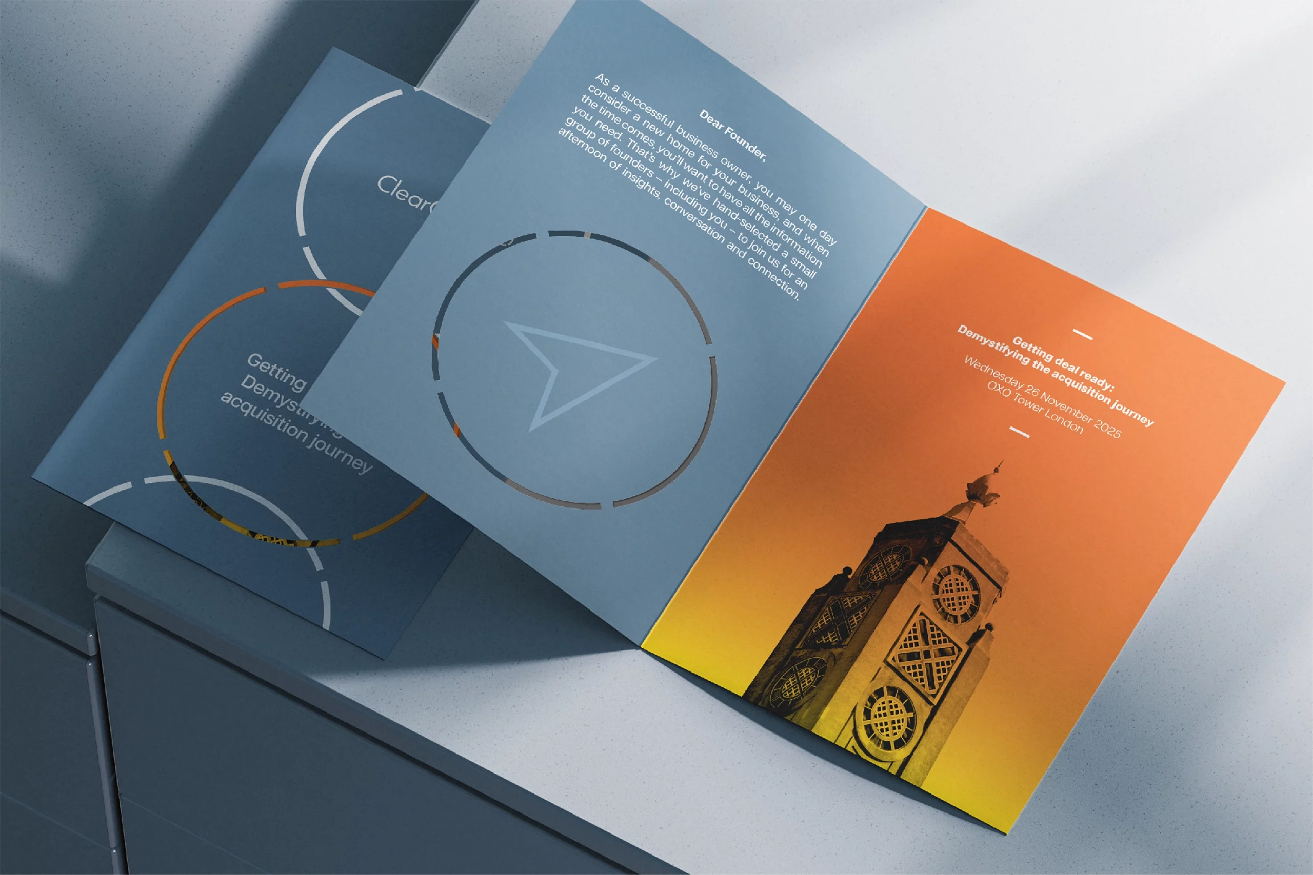
The rebrand was designed to ensure a seamless translation to physical touchpoints including large format, signage and event invitations, alongside publications such as the quarterly ‘Founders Circle’ A4 magazine.
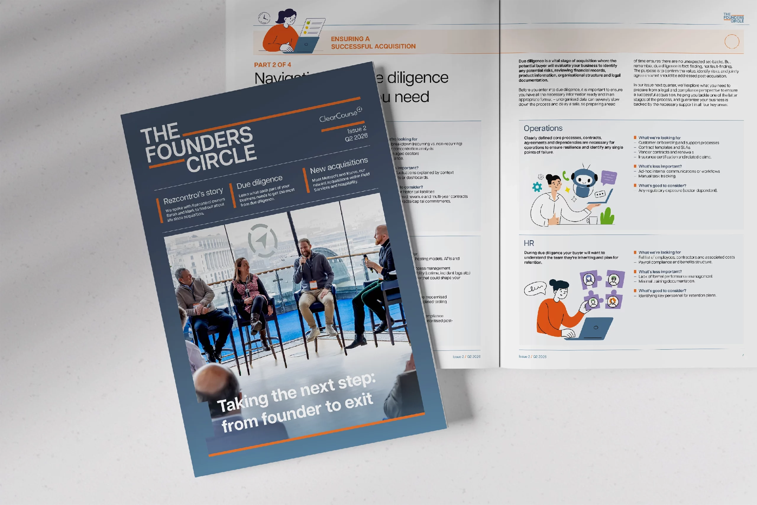
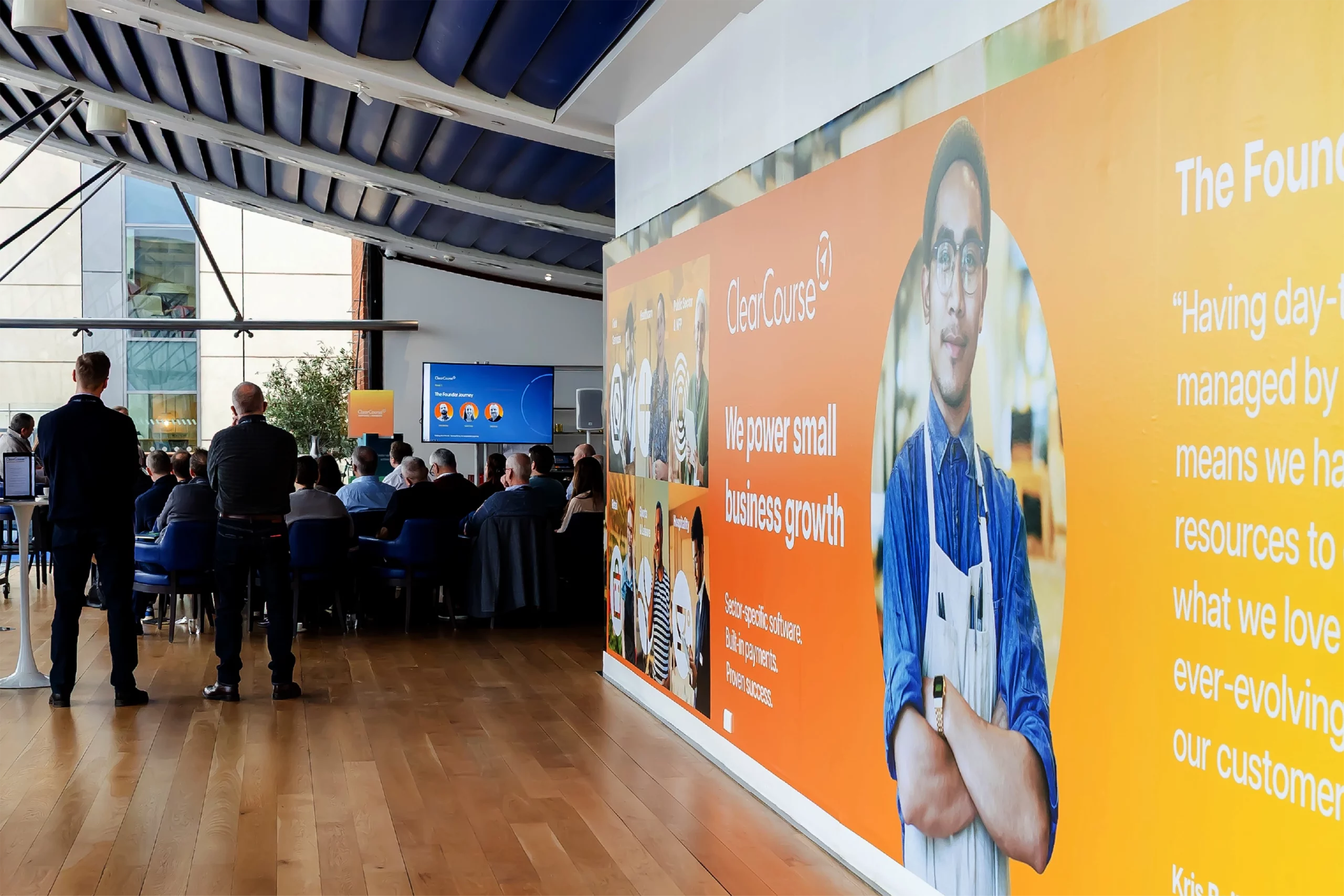
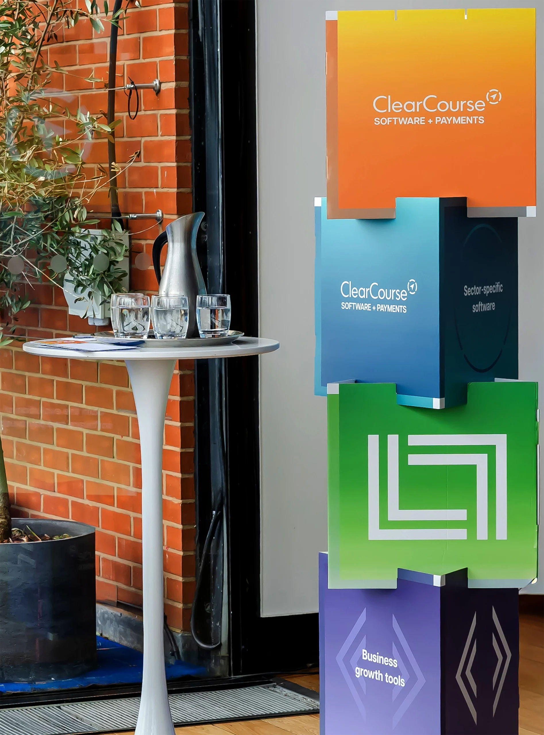
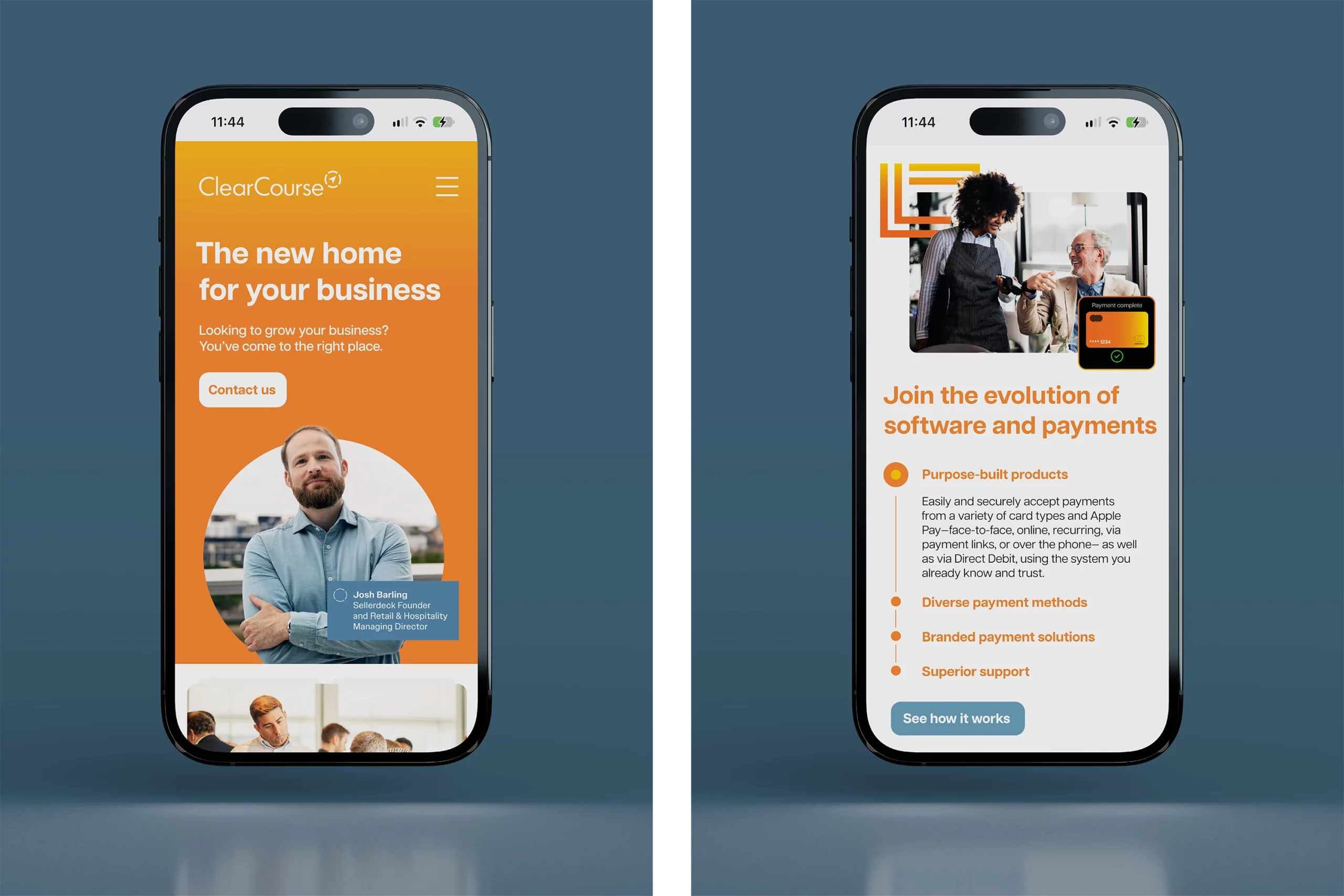
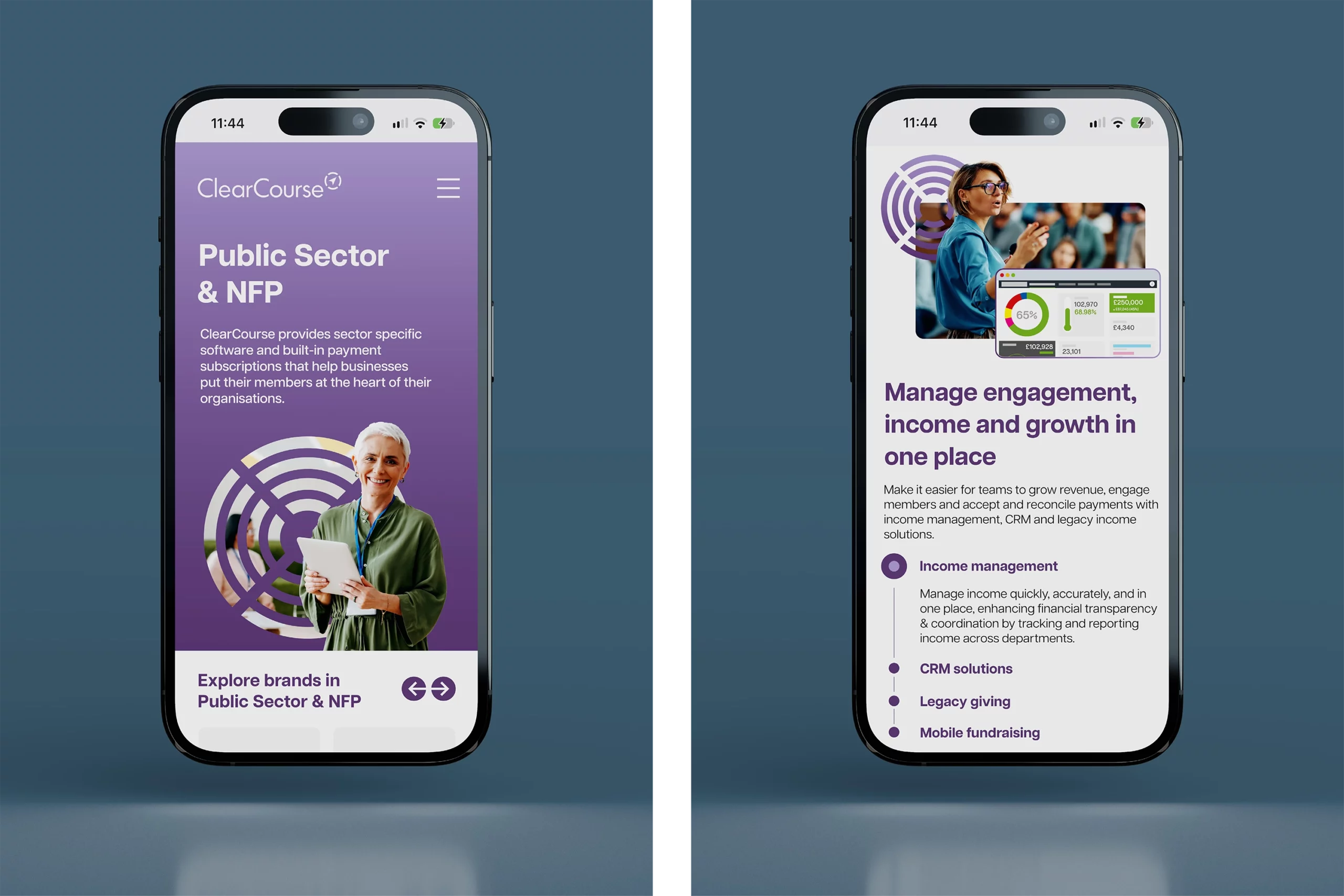
Following the client brief, the graphic language of the rebrand was shaped to accommodate images of real colleagues and customers alongside carefully curated stock imagery. The internal-facing division icons and palettes were re-used externally to provide simple, clear visual variation while remaining on-brand.